Heat Map Overview
Heat map, a density visualization technique, shows areas of high and low concentration on a map. While, a point map with 10’s of thousands of locations can become cluttered, a heat map visualization of the same data can quickly show areas of dense population.
For example, if you plot the locations of all your customers as a heat map, you can quickly see where there are pockets of low or high number of customers.
ZeeMaps provides support for a these maps in both the interactive and print versions. Currently, we look at the frequency, or number of points at a given location, to determine the density. Over time we’ll extend this to allow for the density value to be determined through one of the the marker fields.
Notice, you can combine this feature with the Zip Code Finder tool in ZeeMaps. Finally, a great way to quickly determine the zip codes with high density of points on a map!
Example Map
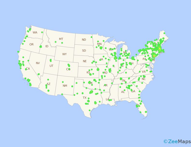
Here’s an example of a heat map of locations of all the Used Computer Stores in the US. First, with the map, one can quickly see that Boston and New York are the most dense areas. While, other major cities like San Francisco, Dallas, etc., have some notable presence as well.
Now, click on the icon at the top right of the map. Notice, the display will change to the regular clustered point map.
We can also get an image of the same map, using the menu item Print or Share -> PDF/PNG Image. In the resulting dialog, we check the option for “Heat Map” for the pin style.

Setting a Heat Map in ZeeMaps
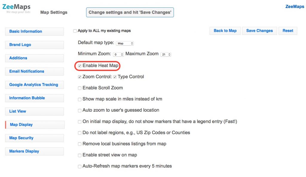
Turn on the this feature for your map. First, go to the settings page (menu Map -> Settings). Second, click on the Map Display tab. Third, check the box for “Enable Heat Map” and hit Save Changes. Last, go back to the map to view the change. Finally, there will be a small icon at the top right of the map (see interactive map above). You can click on that icon to toggle the display from a heat to a regular point map.

Very cool! I look forward to putting this to use!